The next few days are vital – “one of the last moments to weave it all together – to look politically credible to the people Labour has lost”, one senior figure reckons.
There have been huge fights inside government about the looming Spending Review.
As I write, the home secretary and deputy prime minister are both still in dispute with the mighty Treasury over the amount of cash they’ll have to spend.
But the Treasury’s already trying to convince the public the review is about significant investment.
On Wednesday Rachel Reeves boasted of funnelling billions more taxpayers’ cash to big transport projects outside the wealthier south east of England, having tweaked the Treasury rules to do it.
Now, with five days still to go, I’ve been passed some of the information that’ll be in the pages of Wednesday’s review.
It’s one crucial chart that will be in the huge bundle of documents heading to the printing presses on Tuesday night that shows what’s called TDEL – the Total Departmental Expenditure Limit.
In other words, the total that government spends, including the day-to-day costs of running public services and long-term spending on big projects.
But it doesn’t include costs that government can’t set in advance – like pensions and benefits, or debt interest.
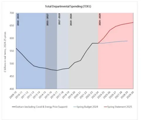
The chart spans 2010 to 2030, so takes in the coalition years, where you can see the total sliding down, then the Conservative years when spending starts rising after the Brexit referendum, then leaps up during Covid.
And then, when Labour took charge, the red line going up steeply at first, then more slowly towards the end of this parliamentary term.
The total real terms spending by 2029-30? More than £650bn – roughly £100bn more than when Labour took office.
The pale blue line is what would have happened to spending if the Conservatives had managed to hang on to power last year.
The government now is allergic to accusations that any cuts they make will be a return to austerity. And this chart shows that overall spending is going up considerably, compared to those lean years.
The political argument around spending will rage but the chancellor did – to use the ghastly technical term – set out the “spending envelope” in her autumn Budget, indicating rises were coming.
You can bet they’ll want to use every chance they have to say they are spending significantly more than the Tories planned to under Rishi Sunak.
The government’s political opponents on the other hand, may look at that red line as it climbs steeply upwards and say: “See, public spending is ballooning out of control”.
This chart does illustrate very significant rises in public spending. But be careful. What this chart doesn’t give us is any idea of how those massive totals break down. Massive chunks will go to favoured departments, suggestions of an extra £30bn for the NHS today.
And a very significant part of that steep rise will be allocated to long-term projects, not running public services, some of which are struggling.
The overall total may be enormous, but a couple of parts of government greedily suck in billions – others will still feel the pain.
 Reuters
A case in point – as I write on Saturday morning, the Home Office is still arguing over its settlement, believing there isn’t enough cash to provide the number of police the government has promised, while the front pages are full of stories about the NHS receiving another bumper deal.
So observe this big health warning. The chart gives us a sense of the political argument the chancellor will make.
But it doesn’t tell the full story or give the crucial totals, department by department, decision by decision.